Global updates Capital logo and removes radio frequencies
A new logo for Capital, which removes the frequencies and waveband it previously advertised, is now in use for the Global radio station.
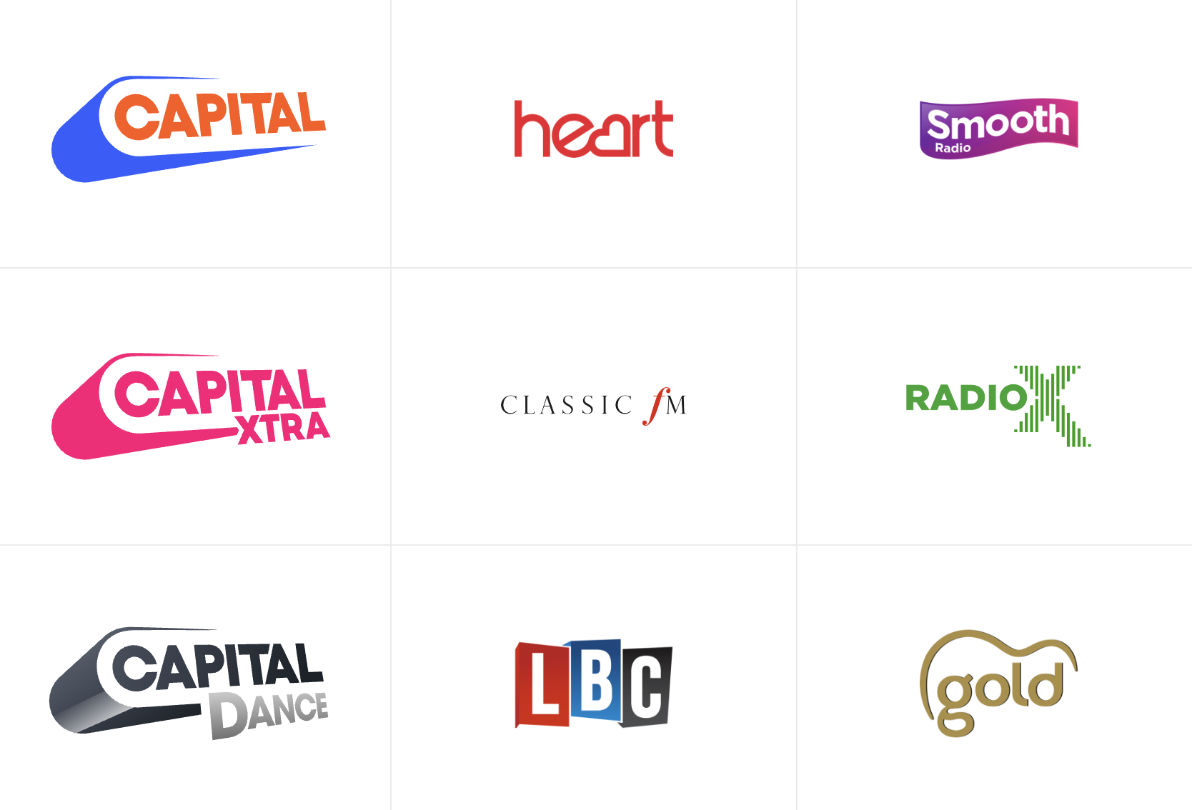
The blue and orange logo for the main service simply says Capital in capital letters, with a slogan version also in use. The on-air output dropped the “FM” bit many years ago.
Other Capital brands have a tweaked version of the logo, with new colours and a new font for Capital Dance.
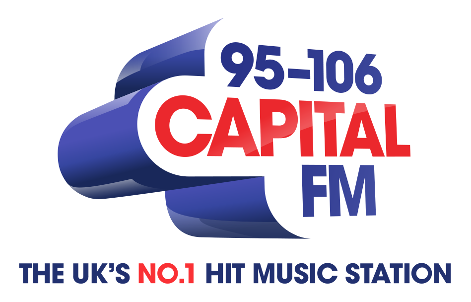
The logo until now had 95-106 FM as the available frequencies, which continued to be used even after the station was available outside of this range in places such as Brighton, Banbury and Blackburn.
When asked about the new logo, a spokesperson for Global said: “Capital will have the flexibility to use a broad range of colour options of the new logo in all sorts of use cases to really widen the brand.
“The new visual identity allows much more creativity to express what Capital is – on social, in video, in the studio, at live events, in app, online and in adverts.”
Across Global, only two logo remains containing the word Radio.

Here’s the old Capital logo for comparison:

Posted on Wednesday, November 2nd, 2022 at 5:19 pm by Roy Martin


